Textbook Question
Refer to the sample statistics from Exercise 5 and determine whether any of the house prices below are unusual. Explain your reasoning.
d. \$147,000
 Verified step by step guidance
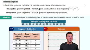
 05:54
05:54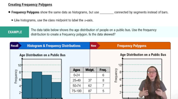 04:41
04:41 4:01
4:01Refer to the sample statistics from Exercise 5 and determine whether any of the house prices below are unusual. Explain your reasoning.
d. \$147,000
The data set represents the number of minutes a sample of 27 people exercise each week.
108 139 120 123 120 132 123 131 131
157 150 124 111 101 135 119 116 117
127 128 139 119 118 114 127 142 130
g. Display the data using a box-and-whisker plot.
Refer to the sample statistics from Exercise 5 and determine whether any of the house prices below are unusual. Explain your reasoning.
a. \$225,000
The data set represents the number of minutes a sample of 27 people exercise each week.
108 139 120 123 120 132 123 131 131
157 150 124 111 101 135 119 116 117
127 128 139 119 118 114 127 142 130
a. Construct a frequency distribution for the data set using five classes. Include class limits, midpoints, boundaries, frequencies, relative frequencies, and cumulative frequencies.
The heights (in feet) and the number of stories of the ten tallest buildings in New York City are listed. Use a scatter plot to display the data. Describe any patterns. (Source: Emporis)
The data set represents the number of minutes a sample of 27 people exercise each week.
108 139 120 123 120 132 123 131 131
157 150 124 111 101 135 119 116 117
127 128 139 119 118 114 127 142 130
d. Describe the shape of the distribution as symmetric, uniform, skewed left, skewed right, or none of these.