Textbook Question
IQ Scores IQ scores of adults are normally distributed. If a large sample of adults is randomly selected and the IQ scores are illustrated in a histogram, what is the shape of that histogram?

 Verified step by step guidance
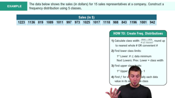
 05:18
05:18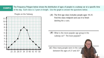 04:15
04:15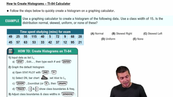 07:10
07:10IQ Scores IQ scores of adults are normally distributed. If a large sample of adults is randomly selected and the IQ scores are illustrated in a histogram, what is the shape of that histogram?
In Exercises 5 and 6, construct the dotplot.
Diastolic Blood Pressure Listed below are diastolic blood pressure measurements (mm Hg) of females selected from Data Set 1 “Body Data” in Appendix B. All of the values are even numbers. Are there any outliers? If so, identify their values.
In Exercises 15 and 16, construct the frequency polygons.
Presidents Use the frequency distribution from Exercise 14 in Section 2-1 to construct a frequency polygon. Does the graph suggest that the distribution is skewed? If so, how?
In Exercises 9–12, using a loose interpretation of the criteria for determining whether a frequency distribution is approximately a normal distribution, determine whether the given frequency distribution is approximately a normal distribution. Give a brief explanation.
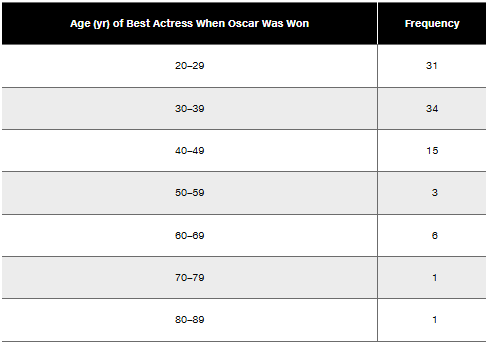
Blood Platelet Counts of Females Refer to the frequency distribution from Exercise 8
Causation A study has shown that there is a correlation between body weight and blood pressure. Higher body weights are associated with higher blood pressure levels. Can we conclude that gaining weight is a cause of increased blood pressure?
In Exercises 5–8, answer the questions by referring to the following Minitab-generated histogram, which depicts the weights (grams) of all quarters listed in Data Set 40 “Coin Weights” in Appendix B. (Grams are actually units of mass and the values shown on the horizontal scale are rounded.)
Relative Frequency Histogram How would the shape of the histogram change if the vertical scale uses relative frequencies expressed in percentages instead of the actual frequency counts as shown here?