Ch. 2 - Exploring Data with Tables and Graphs
Triola - Elementary Statistics 14th Edition
Triola14th EditionElementary StatisticsISBN: 9780137366446Not the one you use?Change textbook
Chapter 2, Problem 2.2.7

In Exercises 5–8, answer the questions by referring to the following Minitab-generated histogram, which depicts the weights (grams) of all quarters listed in Data Set 40 “Coin Weights” in Appendix B. (Grams are actually units of mass and the values shown on the horizontal scale are rounded.)


Histogram showing the frequency of quarter weights in grams, with bars representing weight ranges from 5.5 to 6.4 grams.
Relative Frequency Histogram How would the shape of the histogram change if the vertical scale uses relative frequencies expressed in percentages instead of the actual frequency counts as shown here?

Verified step by step guidance
1
Step 1: Understand the difference between frequency and relative frequency. Frequency represents the count of occurrences in each bin, while relative frequency represents the proportion of occurrences in each bin relative to the total number of data points. Relative frequency can be expressed as a percentage.
Step 2: Calculate the relative frequency for each bin by dividing the frequency of each bin by the total number of data points and then multiplying by 100 to express it as a percentage. For example, if a bin has a frequency of 20 and the total number of data points is 100, the relative frequency would be (20/100) * 100 = 20%.
Step 3: Replace the vertical axis labels with percentages instead of raw frequency counts. The shape of the histogram will remain the same because the relative frequency is proportional to the frequency, but the scale on the vertical axis will change to reflect percentages.
Step 4: Interpret the histogram with the new vertical scale. The heights of the bars will now represent the percentage of the total data points that fall within each bin, rather than the raw count.
Step 5: Note that the overall visual appearance of the histogram (the distribution shape) does not change, as the relative frequency is directly proportional to the frequency. The change is only in the labeling of the vertical axis.

Verified video answer for a similar problem:

This video solution was recommended by our tutors as helpful for the problem above.
Video duration:
2m
Was this helpful?

Key Concepts

Here are the essential concepts you must grasp in order to answer the question correctly.

Histogram

A histogram is a graphical representation of the distribution of numerical data, where the data is divided into intervals (bins) and the frequency of data points within each interval is represented by the height of bars. In this case, the histogram shows the frequency of quarter weights in grams, allowing for visual analysis of weight distribution.
Recommended video:
Guided course
05:54
Intro to Histograms

Relative Frequency

Relative frequency is the ratio of the frequency of a particular value or range of values to the total number of observations. It is often expressed as a percentage, providing a way to compare different categories or intervals on a common scale. If the histogram were to use relative frequencies, the heights of the bars would reflect the proportion of total weights rather than absolute counts.
Recommended video:
Guided course
06:38
Intro to Frequency Distributions

Shape of the Histogram

The shape of a histogram refers to the overall pattern formed by the bars, which can indicate the distribution of the data (e.g., normal, skewed, bimodal). Changing the vertical scale to relative frequencies may alter the perceived shape, as it emphasizes the proportion of weights rather than their raw counts, potentially highlighting different aspects of the data distribution.
Recommended video:
Guided course
05:54
Intro to Histograms
Related Practice
Textbook Question

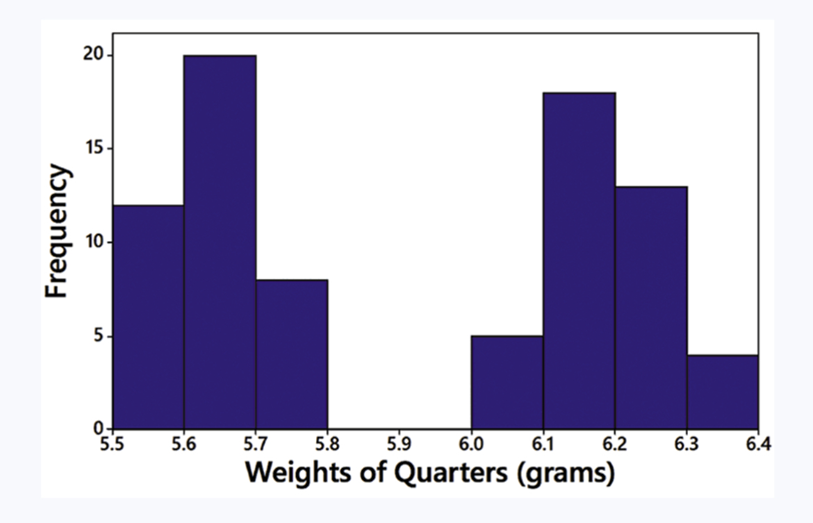
In Exercises 5–8, identify the class width, class midpoints, and class boundaries for the given frequency distribution. Also identify the number of individuals included in the summary. The frequency distributions are based on real data from Appendix B.

1
views
Textbook Question

In Exercises 9–12, using a loose interpretation of the criteria for determining whether a frequency distribution is approximately a normal distribution, determine whether the given frequency distribution is approximately a normal distribution. Give a brief explanation.

Blood Platelet Counts of Females Refer to the frequency distribution from Exercise 8

1
views
Textbook Question

Causation A study has shown that there is a correlation between body weight and blood pressure. Higher body weights are associated with higher blood pressure levels. Can we conclude that gaining weight is a cause of increased blood pressure?

Textbook Question

In Exercises 9–18, construct the histograms and answer the given questions.


Burger King Dinner Service Times Use the frequency distribution from Exercise 18 in Section 2-1 to construct a histogram. Using a strict interpretation of the criteria for being a normal distribution, does the histogram appear to depict data from a population with a normal distribution?

Textbook Question

In Exercises 5–8, answer the questions by referring to the following Minitab-generated histogram, which depicts the weights (grams) of all quarters listed in Data Set 40 “Coin Weights” in Appendix B. (Grams are actually units of mass and the values shown on the horizontal scale are rounded.)

Class Width and Class Limits Give the approximate values of the class width, and the lower and upper class limits of the class depicted in the bar farthest to the left.

1
views
Textbook Question

In Exercises 25 and 26, construct the cumulative frequency distribution that corresponds to the frequency distribution in the exercise indicated.


Exercise 5 (Age of Best Actress When Oscar Was Won)

1
views