

 06:36
06:36
Textbook Question
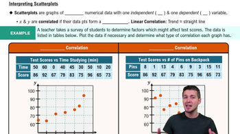
Time and Motion In a physics experiment at Doane College, a soccer ball was thrown upward from the bed of a moving truck. The table below lists the time (sec) that has lapsed from the throw and the corresponding height (m) of the soccer ball.
[IMAGE]
a. Find the value of the linear correlation coefficient r.
4
views