Skip to main content
Statistics for Business
My Course
Learn
Exam Prep
AI Tutor
Study Guides
Flashcards
Explore
Try the app
My Course
Learn
Exam Prep
AI Tutor
Study Guides
Flashcards
Explore
Try the app
Back
Creating Scatterplots and FInding Correlation Coefficient - Excel quiz
You can tap to flip the card.
What is the purpose of creating a scatterplot in Excel when analyzing two variables?
You can tap to flip the card.
👆
What is the purpose of creating a scatterplot in Excel when analyzing two variables?
A scatterplot helps visualize the linear correlation between two variables, showing the strength and direction of their relationship.
Track progress
Control buttons has been changed to "navigation" mode.
1/15
Related flashcards
Related practice
Recommended videos
Creating Scatterplots and FInding Correlation Coefficient - Excel definitions
Creating Scatterplots and FInding Correlation Coefficient - Excel
14 Terms
11. Correlation
2 topics
15 problems
Chapter
David-Paige
Guided course
02:32
Creating Scatterplots and FInding Correlation Coefficient - Excel Example 1
2
views
Guided course
04:09
Creating Scatterplots and FInding Correlation Coefficient - Excel
2
views
Terms in this set (15)
Hide definitions
What is the purpose of creating a scatterplot in Excel when analyzing two variables?
A scatterplot helps visualize the linear correlation between two variables, showing the strength and direction of their relationship.
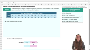
Which Excel menu do you use to insert a scatterplot?
You use the 'Insert' menu to add a scatterplot in Excel.
What is the function used in Excel to calculate the correlation coefficient?
The function is =CORREL(array1, array2).
What does a correlation coefficient (r) close to 1 indicate?
It indicates a strong positive linear correlation between the two variables.
How do you select data for a scatterplot in Excel?
You highlight both the x data and y data in your table before inserting the scatterplot.
Why should you add axis titles to your scatterplot in Excel?
Adding axis titles clarifies what each axis represents, making the chart easier to interpret.
What does a positive value of r mean in the context of correlation?
A positive r means that as one variable increases, the other variable also tends to increase.
What are the two required inputs for the =CORREL function in Excel?
The two inputs are array1 (x data) and array2 (y data).
How can you change the chart title in an Excel scatterplot?
You can click on the chart title and edit it directly to match your data or table title.
What does it mean if the data points in a scatterplot form a relatively straight line?
It suggests a linear relationship between the two variables.
If r is about 0.9, what can you conclude about the variables?
There is a strong positive linear correlation between the variables.
Where can you find the option to add axis titles in Excel?
You can add axis titles by clicking on the chart and selecting the chart elements icon or using the top ribbon.
What is the benefit of adjusting axis scales in a scatterplot?
Adjusting axis scales can help better fit the data and improve the clarity of the chart.
Why is understanding scatterplots and correlation coefficients important in business analytics?
They help analyze associations, interpret data distributions, and apply statistical concepts like regression and correlation.
What does a correlation coefficient (r) of 0 mean?
It means there is no linear correlation between the two variables.
 BackBack
 02:32
02:32