Skip to main content
Statistics for Business
My Course
Learn
Exam Prep
AI Tutor
Study Guides
Flashcards
Explore
Try the app
My Course
Learn
Exam Prep
AI Tutor
Study Guides
Flashcards
Explore
Try the app
Back
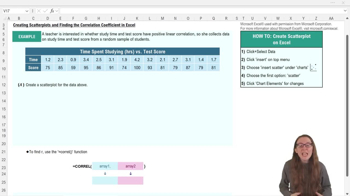
Creating Scatterplots and FInding Correlation Coefficient - Excel definitions
You can tap to flip the card.
Scatterplot
You can tap to flip the card.
👆
Scatterplot
A chart displaying paired data points, revealing patterns or trends in the relationship between two variables.
Track progress
Control buttons has been changed to "navigation" mode.
1/14
Related flashcards
Related practice
Recommended videos
Creating Scatterplots and FInding Correlation Coefficient - Excel quiz
Creating Scatterplots and FInding Correlation Coefficient - Excel
15 Terms
11. Correlation
2 topics
15 problems
Chapter
David-Paige
Guided course
02:32
Creating Scatterplots and FInding Correlation Coefficient - Excel Example 1
2
views
Guided course
04:09
Creating Scatterplots and FInding Correlation Coefficient - Excel
2
views
Terms in this set (14)
Hide definitions
Scatterplot
A chart displaying paired data points, revealing patterns or trends in the relationship between two variables.
Correlation Coefficient
A numerical value, often r, quantifying the strength and direction of a linear relationship between two variables.
Linear Correlation
A relationship where changes in one variable are associated with proportional changes in another, forming a straight-line pattern.
Axis Titles
Labels on a chart's horizontal and vertical lines, clarifying what each axis represents for better interpretation.
Chart Title
A heading on a graph summarizing the main focus or comparison depicted by the visualized data.
Array
A selection of data values, typically organized in columns or rows, used as input for statistical functions.
Positive Correlation
A relationship where increases in one variable tend to accompany increases in another variable.
Excel Function
A built-in formula in spreadsheet software that performs calculations or data analysis, such as =CORREL.
Chart Elements
Components of a graph, including titles, axes, and data markers, that enhance clarity and interpretation.
Axis Scale
The range and intervals of values shown on a chart's axis, affecting how data distribution is visualized.
Data Table
An organized arrangement of values, often in rows and columns, serving as the source for chart creation.
Regression
A statistical method for modeling the relationship between variables, often used after assessing correlation.
Business Analytics
The practice of using statistical tools and data visualization to inform decision-making in organizational contexts.
Experimental Design
A structured approach to collecting and analyzing data to investigate relationships between variables.
 BackBack
 02:32
02:32