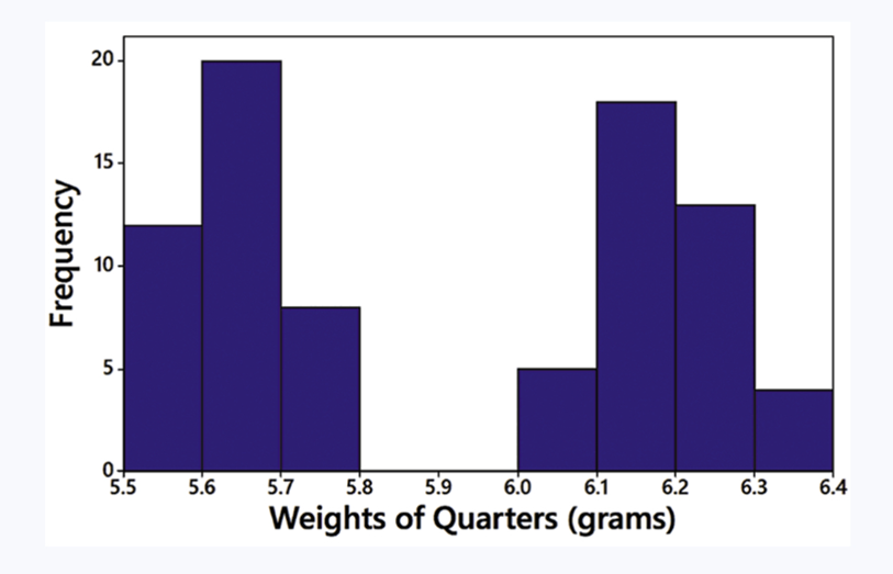
Ch. 2 - Exploring Data with Tables and Graphs
Triola - Elementary Statistics 14th Edition
Triola14th EditionElementary StatisticsISBN: 9780137366446Not the one you use?Change textbook
Chapter 2, Problem 2.2.5

In Exercises 5–8, answer the questions by referring to the following Minitab-generated histogram, which depicts the weights (grams) of all quarters listed in Data Set 40 “Coin Weights” in Appendix B. (Grams are actually units of mass and the values shown on the horizontal scale are rounded.)
Histogram showing the frequency of quarter weights in grams, with values ranging from 5.5 to 6.4 grams.


Sample Size What is the approximate number of quarters depicted in the three bars farthest to the left?

Verified step by step guidance
1
Step 1: Observe the histogram provided. The horizontal axis represents the weights of quarters in grams, and the vertical axis represents the frequency (number of quarters) for each weight range.
Step 2: Identify the three bars farthest to the left on the histogram. These bars correspond to the weight ranges 5.5–5.6, 5.6–5.7, and 5.7–5.8 grams.
Step 3: Note the frequency values for each of these bars. From the histogram: the first bar (5.5–5.6 grams) has a frequency of approximately 10, the second bar (5.6–5.7 grams) has a frequency of approximately 20, and the third bar (5.7–5.8 grams) has a frequency of approximately 5.
Step 4: Add the frequencies of these three bars to determine the approximate total number of quarters depicted in the three bars farthest to the left. This involves summing the frequencies: 10 + 20 + 5.
Step 5: Conclude that the approximate number of quarters in the three bars farthest to the left is the sum obtained in Step 4.

Verified video answer for a similar problem:

This video solution was recommended by our tutors as helpful for the problem above.
Video duration:
3m
Was this helpful?

Key Concepts

Here are the essential concepts you must grasp in order to answer the question correctly.

Histogram

A histogram is a graphical representation of the distribution of numerical data, where the data is divided into intervals (bins) on the x-axis, and the frequency of data points within each interval is represented by the height of the bars. In this case, the histogram shows the weights of quarters in grams, allowing for visual analysis of how many quarters fall within specific weight ranges.
Recommended video:
Guided course
05:54
Intro to Histograms

Frequency

Frequency refers to the number of occurrences of a particular value or range of values in a dataset. In the context of the histogram, the height of each bar indicates the frequency of quarters that fall within the corresponding weight interval. Understanding frequency is essential for interpreting the data distribution and answering questions about sample size.
Recommended video:
04:41
Creating Frequency Polygons

Sample Size

Sample size is the number of observations or data points collected in a study or experiment. In this question, determining the sample size involves summing the frequencies of the three bars on the left side of the histogram, which represent the weights of quarters in the lower range. Knowing the sample size is crucial for statistical analysis and drawing conclusions from the data.
Recommended video:
05:11
Sampling Distribution of Sample Proportion
Related Practice
Textbook Question

In Exercises 17–20, identify how the graph is deceptive.


Cost of Giving Birth According to the Agency for Healthcare Research and Quality Healthcare Cost and Utilization Project, the typical cost of a C-section baby delivery is \$4500, and the typical cost of a vaginal delivery is \$2600. See the following illustration.


Textbook Question

In Exercises 9–18, construct the histograms and answer the given questions.


Analysis of Last Digits Use the frequency distribution from Exercise 21 in Section 2-1 to construct a histogram. What can be concluded from the distribution of the digits? Specifically, do the heights appear to be reported or actually measured?

1
views
Textbook Question

In Exercises 5–8, identify the class width, class midpoints, and class boundaries for the given frequency distribution. Also identify the number of individuals included in the summary. The frequency distributions are based on real data from Appendix B.

8.

3
views
Textbook Question

Boston Commute Time The accompanying table summarizes daily commute times in Boston. How many commute times are included in the summary? Is it possible to identify the exact values of all of the original data amounts?

2
views
Textbook Question

In Exercises 15 and 16, construct the frequency polygons.


Chicago Commute Times Use the frequency distribution from Exercise 13 in Section 2-1 to construct a frequency polygon. Does the graph suggest that the distribution is skewed? If so, how?


Textbook Question

In Exercises 9–18, construct the histograms and answer the given questions.


Old Faithful Use the frequency distribution from Exercise 15 in Section 2-1 to construct a histogram. Does it appear to be the graph of data from a population with a normal distribution?