Ch. 2 - Descriptive Statistics
Larson - Elementary Statistics: Picturing the World 8th Edition
Larson8th EditionElementary Statistics: Picturing the WorldISBN: 9780137493470Not the one you use?Change textbook
Chapter 2, Problem 2.3.37

In Exercises 37– 40, without performing any calculations, determine which measure of central tendency best represents the graphed data. Explain your reasoning.


<IMAGE>

Verified step by step guidance
1
Step 1: Observe the graph provided. The x-axis represents the response categories for how often people change jobs, and the y-axis represents the frequency of responses. The graph shows that the highest frequency is for the category 'Stayed at one job for more than 10 years.'
Step 2: Understand the measures of central tendency: Mean, Median, and Mode. The mean is the average of all data points, the median is the middle value when data is ordered, and the mode is the most frequently occurring value.
Step 3: Analyze the distribution of the data. The graph is skewed to the right, with one category ('Stayed at one job for more than 10 years') having a significantly higher frequency compared to others. This suggests that the mode might be the best measure of central tendency, as it represents the most common response.
Step 4: Consider the limitations of the mean and median in this context. The mean could be influenced by the skewness of the data, and the median might not effectively represent the most common response due to the uneven distribution.
Step 5: Conclude that the mode is the best measure of central tendency for this data, as it directly identifies the most frequent response category ('Stayed at one job for more than 10 years').

Verified video answer for a similar problem:

This video solution was recommended by our tutors as helpful for the problem above.
Video duration:
2m
Was this helpful?

Key Concepts

Here are the essential concepts you must grasp in order to answer the question correctly.

Measures of Central Tendency

Measures of central tendency, including the mean, median, and mode, summarize a set of data points with a single representative value. The mean is the average, the median is the middle value when data is ordered, and the mode is the most frequently occurring value. Understanding these measures helps in determining which best represents the data based on its distribution and characteristics.
Recommended video:
Guided course
04:52
Calculating the Mean

Distribution Shape

The shape of a data distribution can significantly influence which measure of central tendency is most appropriate. For instance, a skewed distribution may render the mean misleading, while the median provides a better central value. Recognizing whether the data is symmetric, skewed, or has outliers is crucial for selecting the right measure.
Recommended video:
05:11
Sampling Distribution of Sample Proportion

Frequency Distribution

A frequency distribution displays how often each value occurs within a dataset, often represented in a histogram or bar chart. In the provided graph, the frequency of job change responses is shown, allowing for visual analysis of trends. This helps in identifying the most common responses and understanding the overall data pattern, which is essential for determining the best measure of central tendency.
Recommended video:
Guided course
06:38
Intro to Frequency Distributions
Related Practice
Textbook Question

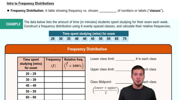
Constructing a Frequency Distribution and a Frequency Polygon In Exercises 35 and 36, construct a frequency distribution and a frequency polygon for the data set using the indicated number of classes. Describe any patterns.

Declaration of Independence

Number of classes: 5

Data set: Number of children of those who signed the Declaration of Independence (Source: The U.S. National Archives & Records Administration) 5 2 12 18 7 4 10 8 16 3 3 7 3 1 2 7 13 0 8 3 7 5 2 6 0 6 7 9 0 11 9 10 7 8 13 5 8 3 5 0 3 13 3 15 5 6 3 2 5 2 0 3 7 12 4 1

Textbook Question

Graphical Analysis In Exercises 19–22, use the box-and-whisker plot to determine whether the shape of the distribution represented is symmetric, skewed left, skewed right, or none of these. Justify your answer.

Textbook Question

Using and Interpreting Concepts


Finding and Discussing the Mean, Median, and Mode In Exercises 17–34, find the mean, the median, and the mode of the data, if possible. If any measure cannot be found or does not represent the center of the data, explain why.


Video Durations The lengths (in minutes) of seven educational videos from the Public Broadcasting Service (PBS) (Source: PBS)

83 67 90 55 56 119 52

Textbook Question

Graphing Data Sets In Exercises 17–32, organize the data using the indicated type of graph. Describe any patterns.


Smartphone Sales The five best-selling smartphone manufacturers of 2020 were Apple (206.1 million units), Huawei (189.0 million units), Samsung (266.7 million units), vivo (111.7 million units), and Xiaomi (147.8 million units). Use a Pareto chart to display the data. (Source: International Data Corporation)

Textbook Question

Graphing Data Sets In Exercises 17–32, organize the data using the indicated type of graph. Describe any patterns.


Highest-Paid Athletes Use a stem-and-leaf plot that has two rows for each stem to display the data, which represent the incomes (in millions) of the top 30 highest-paid athletes. (Source: Forbes Media LLC)

39 42 41 45 48 48 106 45 88 54 61 37 62 74 40

47 56 57 105 96 37 48 41 64 52 47 45 59 49 104

Textbook Question

Estimating the Sample Mean and Standard Deviation for Grouped Data In Exercises 41–44, make a frequency distribution for the data. Then use the table to estimate the sample mean and the sample standard deviation of the data set.

Weekly Study Hours The distribution of the number of hours that a random sample of college students study per week is shown in the pie chart. Use 32 as the midpoint for “30+ hours.”